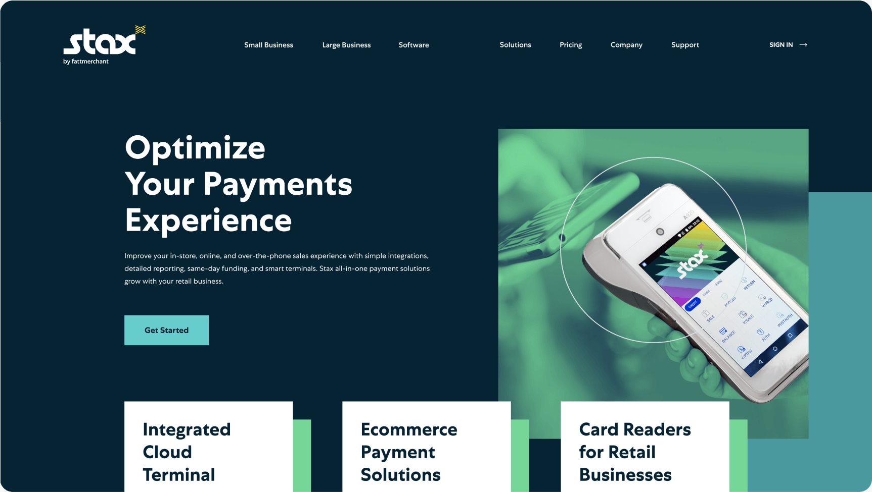
Stax
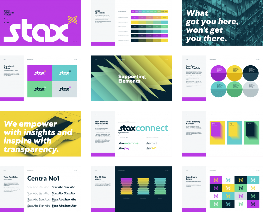
Stax transitioned from a limiting name and brand to the first holistic payment services company for software, small, and large businesses. Big Vision created the brand with an extensive voice and visual strategy.
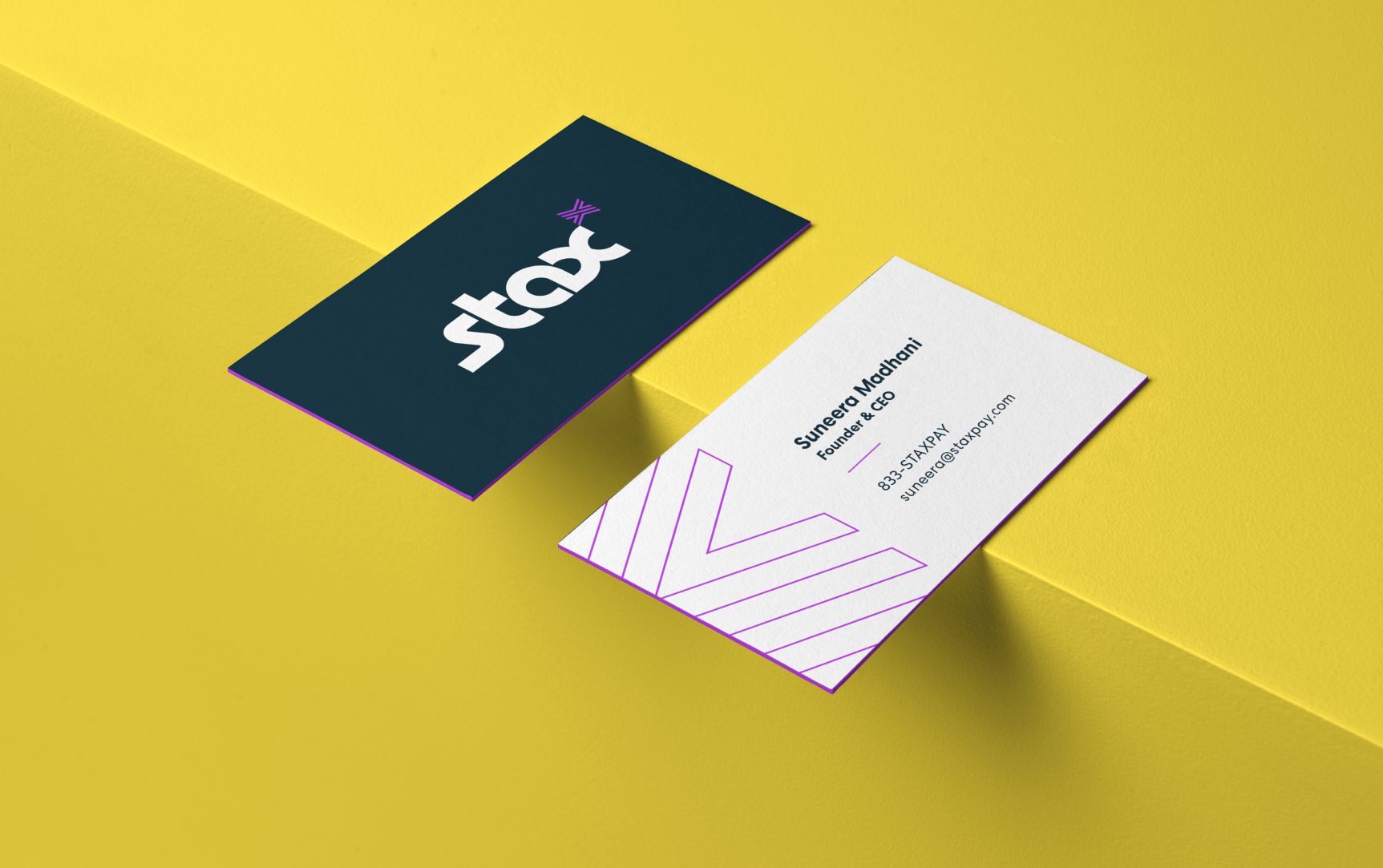
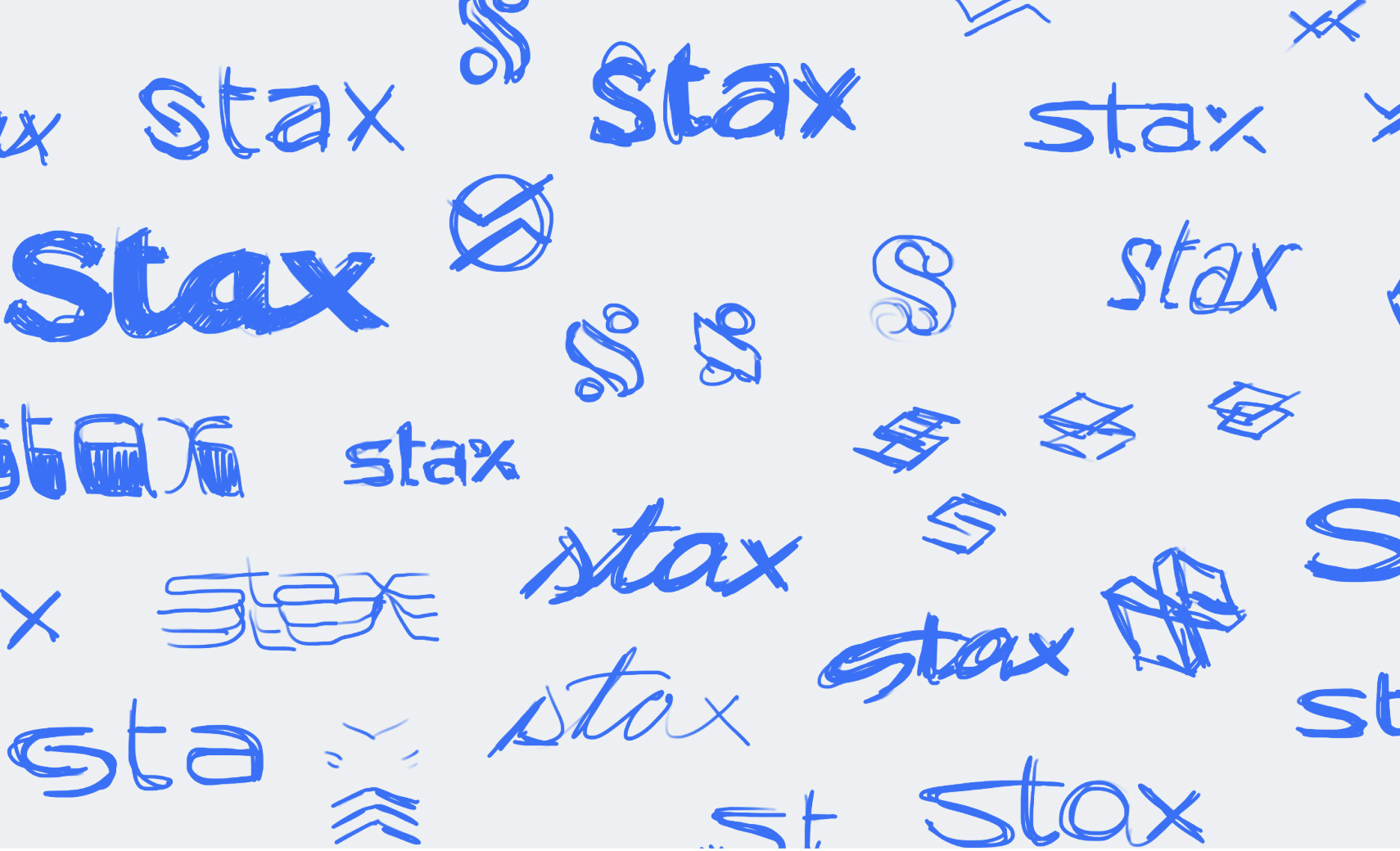
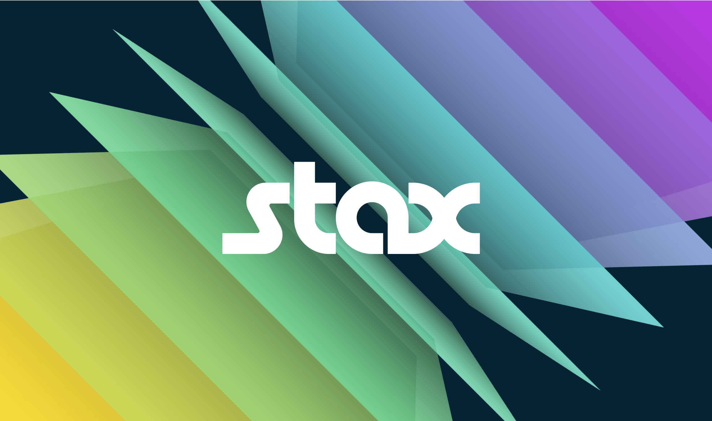
Originally named Fattmerchant, the rebrand became a brand positioning stance, requiring extensive research with staff and customers. The custom type and brand elements were the result of multiple workshops and a rigorous process.
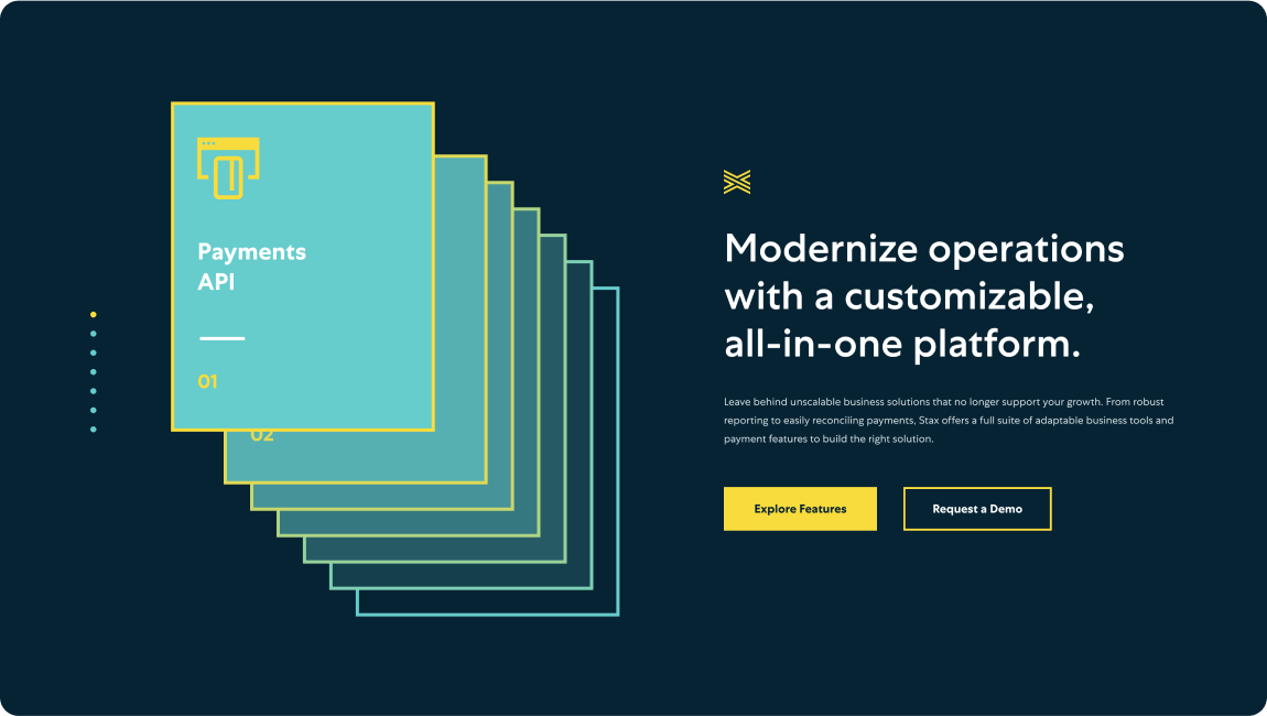
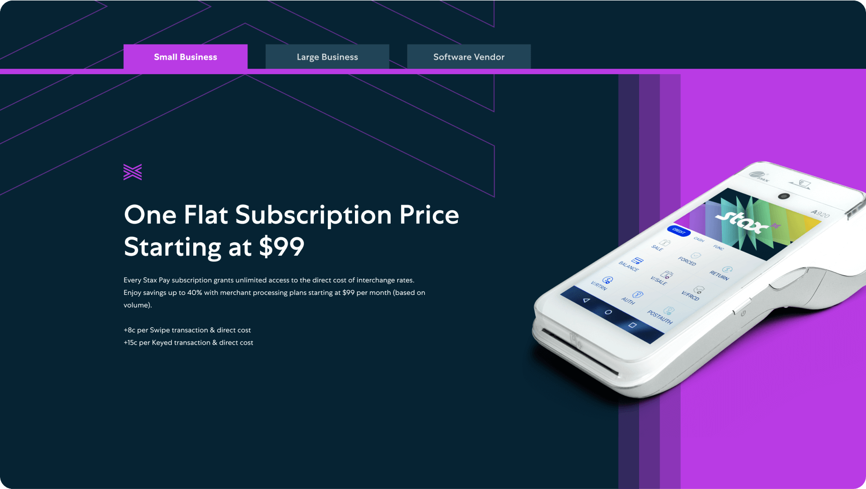
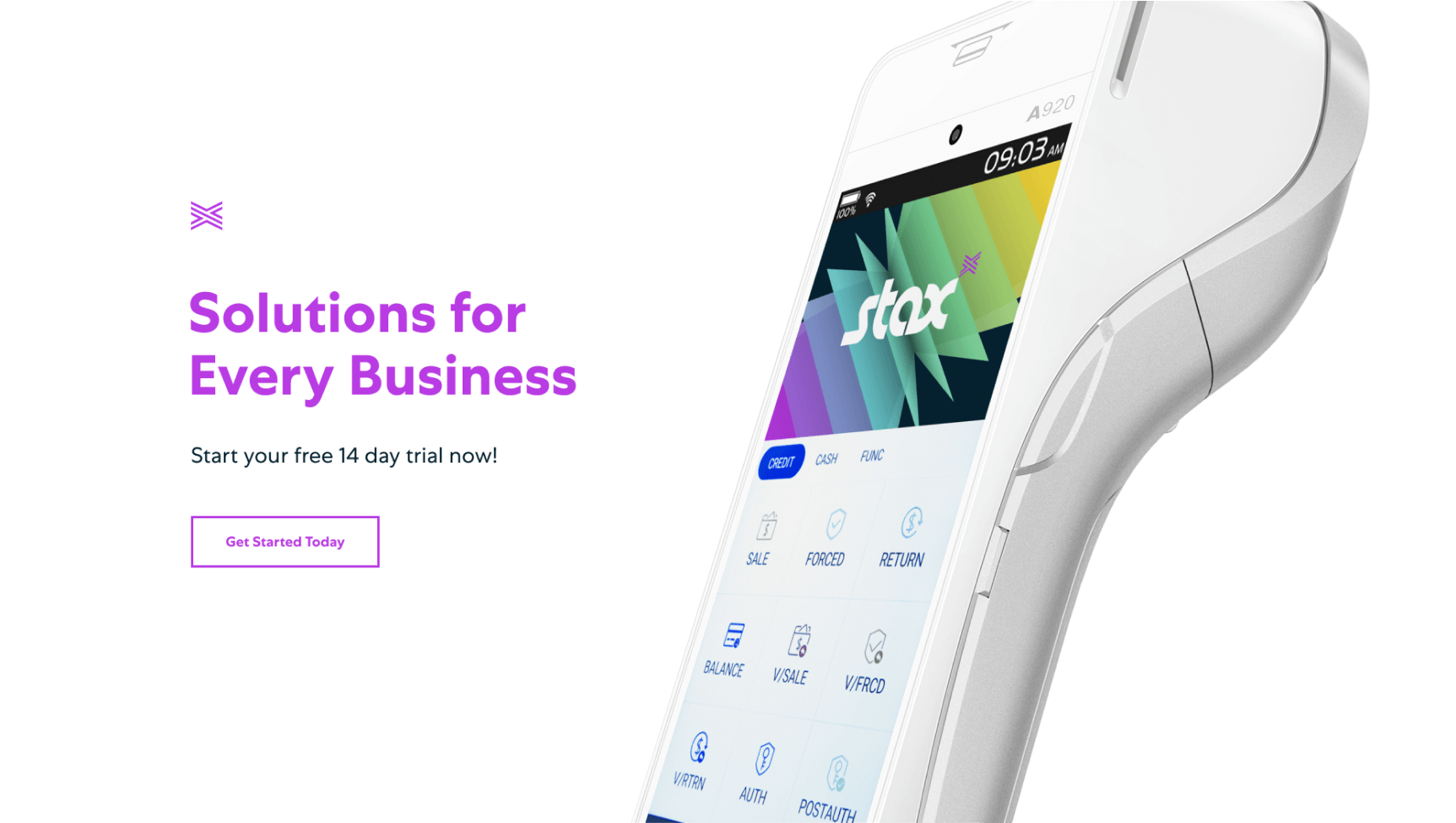
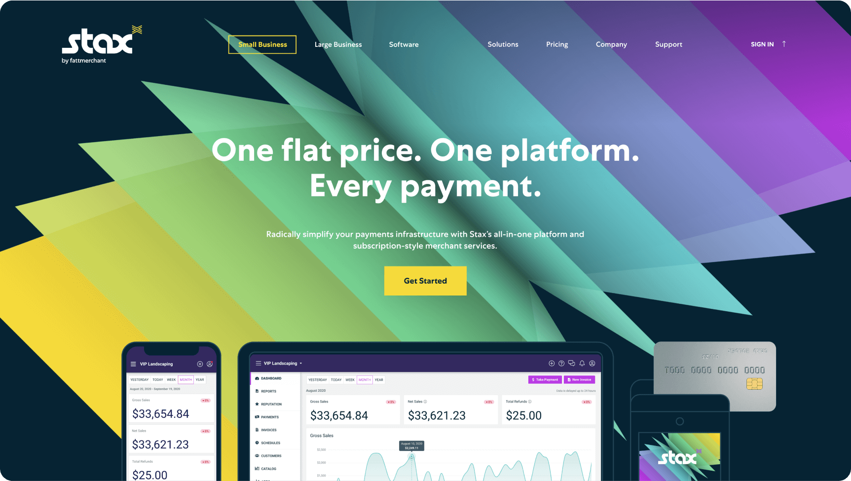
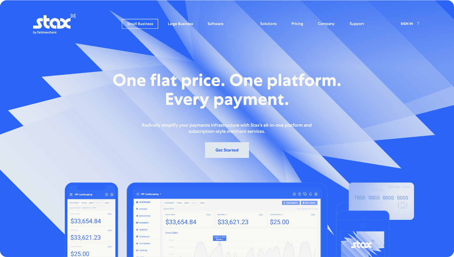
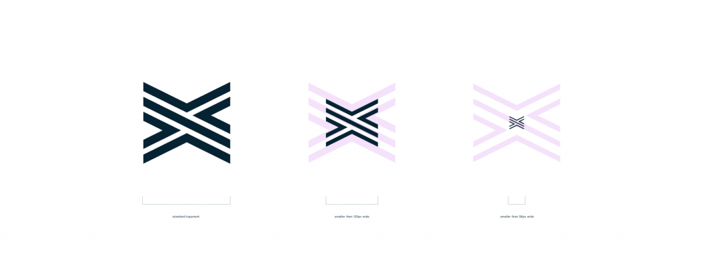
The X-factor element serves as something extra, the force multiplier the staff provides in good service. It also visually represents the ability of the Stax platform to channel and manage multiple payment functions.
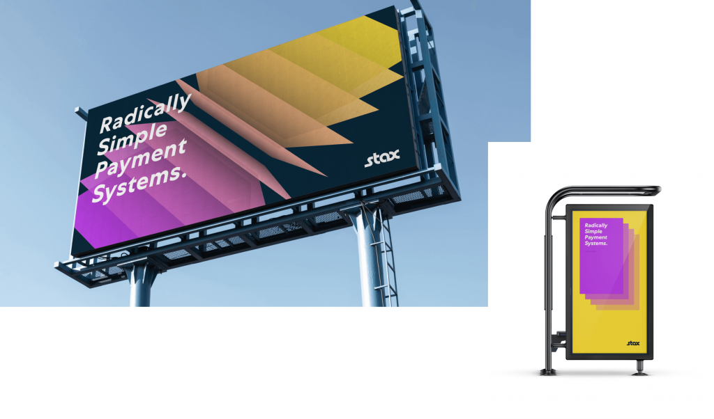
The fan, as we came to call it, illustrates the dynamic relationship between the customizable payment services Stax provides.
Stax required a new identity to accompany their industry-leading market position.

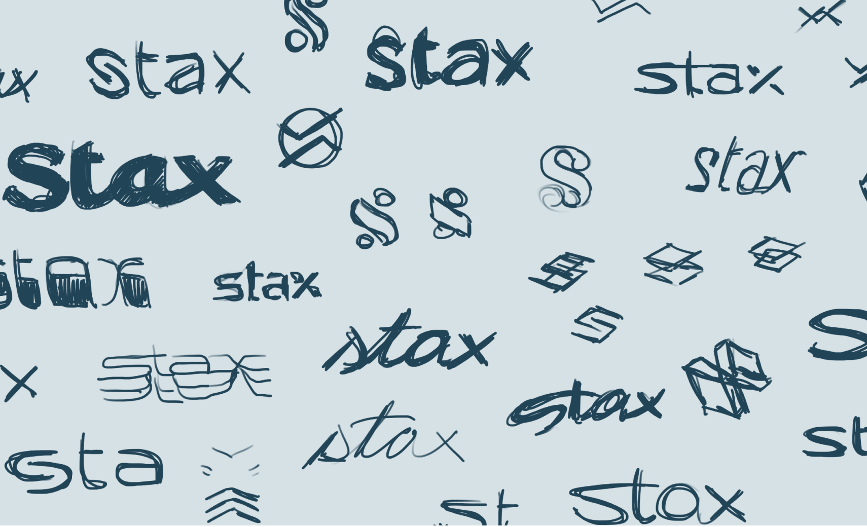
Originally named Fattmerchant, the rebrand became a brand positioning stance, requiring extensive research with staff and customers. The custom type and brand elements were the result of multiple workshops and a rigorous process.


Amazing, amazing job. My heart is so happy. This is everything, EVERYTHING we wanted.”
—Suneera Madhani, Founder and CEO of Stax