
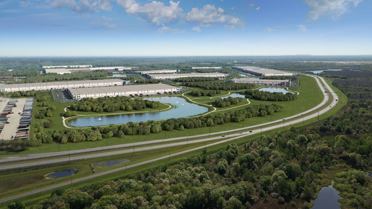
How can an industrial park balance logistical strategy with the charm of its natural location?
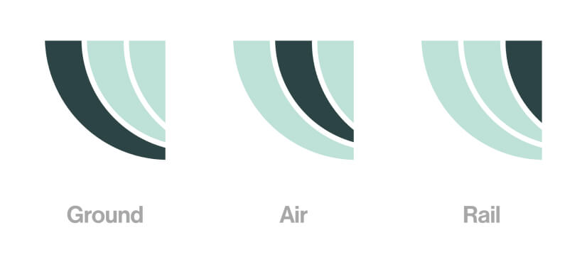
The logomark is an abstract rendering of Lakeland Central Park’s geographic location. The frontage road, center road and boundary lines have been converted to outlines. We call these the pathways.
LCP is pioneering what an industrial park can become for its tenants. A logistics center with a people-first focus.
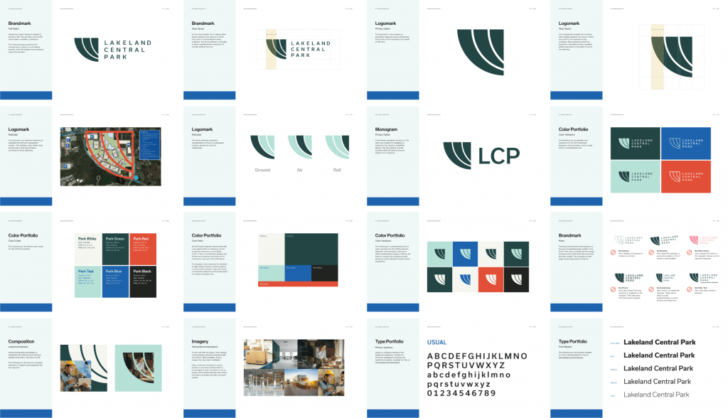


Photography and textures are used in conert with the mark to emphasize the relational and technical logistics working in harmony at LCP.
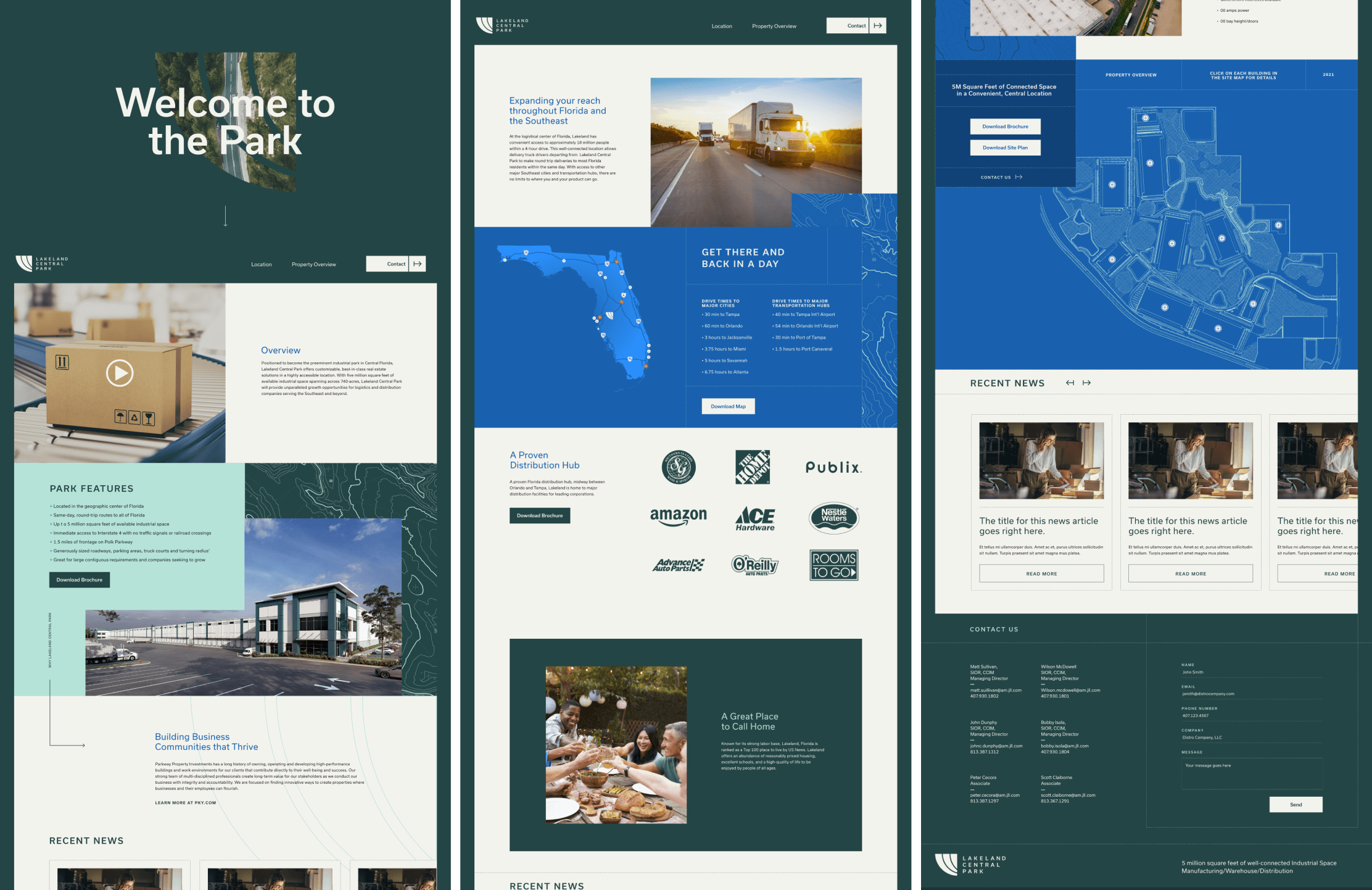
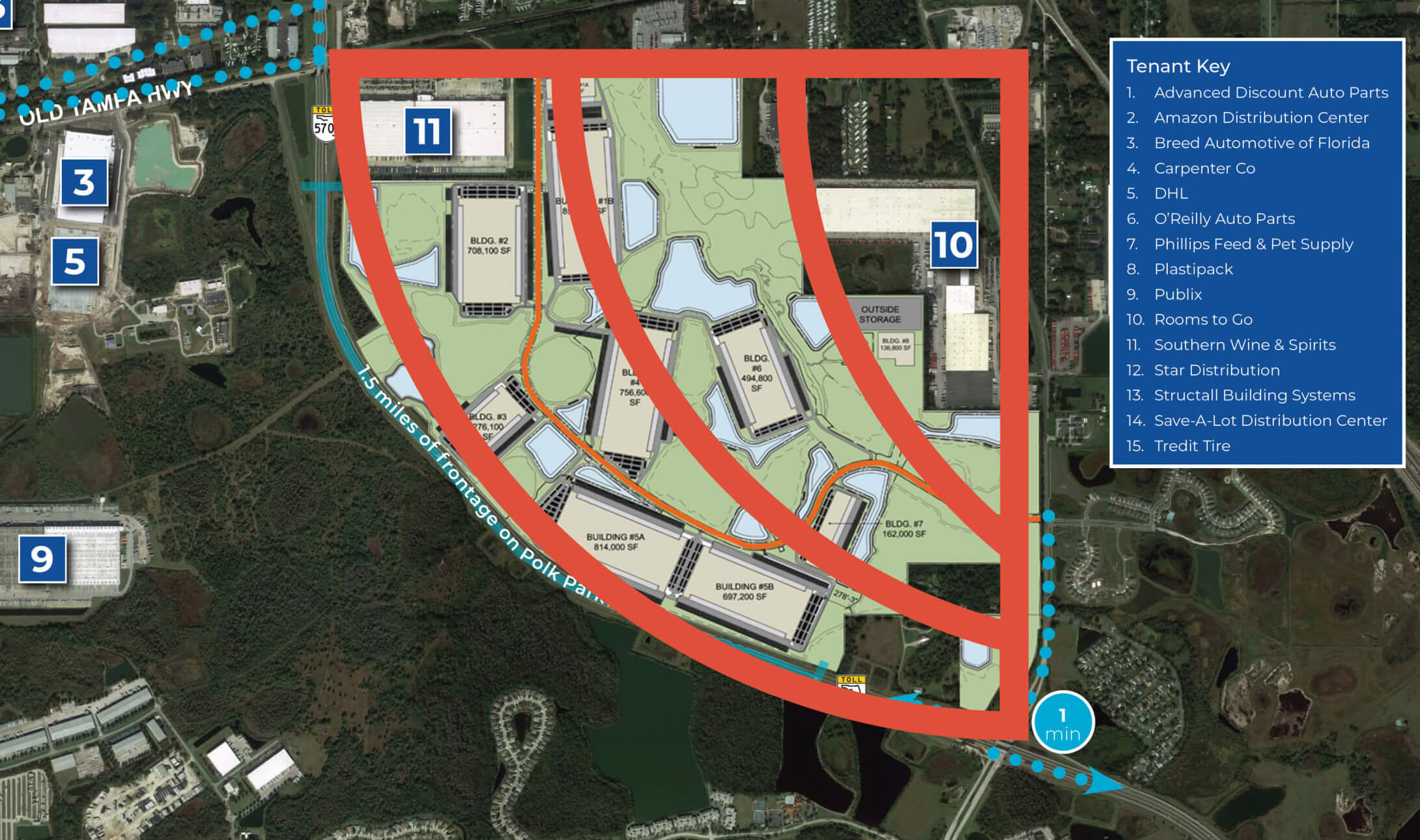
We wanted each brand touchpoint to evoke a relationship to the land, similar to National Geographic or the National Park Service. Topographic maps and dotted lines add the element of precision and strategy, connecting website content.