H&H Products
A beverage manufacturer needed a digital presence that let the personality of their long-tenured team shine through.
This partnership centered around the goal of building a website that lets customers quickly find what they need, showcases H&H’s product selection in an unexpected way, demonstrates H&H’s industry experience and superior customer service, and lets the personality of this long-tenured team shine through.
Everything from product filtering to mixing instructions are presented in an atypical way that doesn’t feel templated. Whether they’re new or returning, subtle details like cursor effects and page transitions boost the customer experience while interacting with H&H.
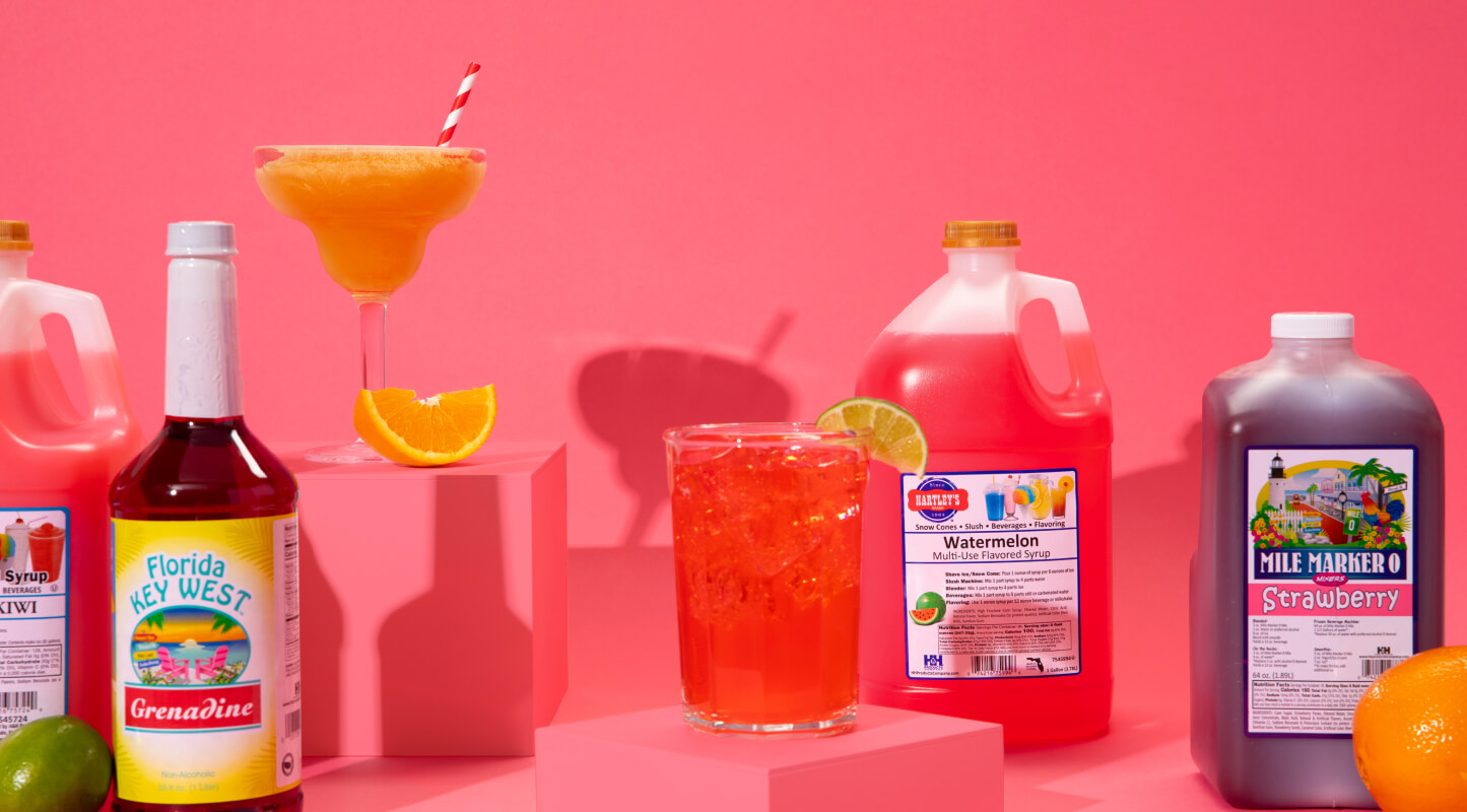
The electric new website launched June 2020. Its punchy photography, vibrant colors, and whimsical design elements help set H&H Products Company apart from its competitors while showing the beverage manufacturing company is, well, fun.

How can a food and beverage company excite its customers?


Unexpected touches like cursor designs bring a sense of whimsy to the beverage manufacturing industry.
The revitilized brand style balances the sweetness of a family company with the tactical sophistication of an online distributor.
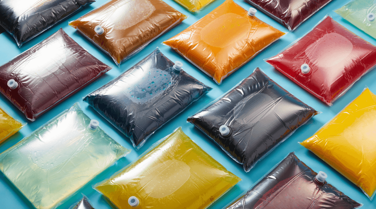
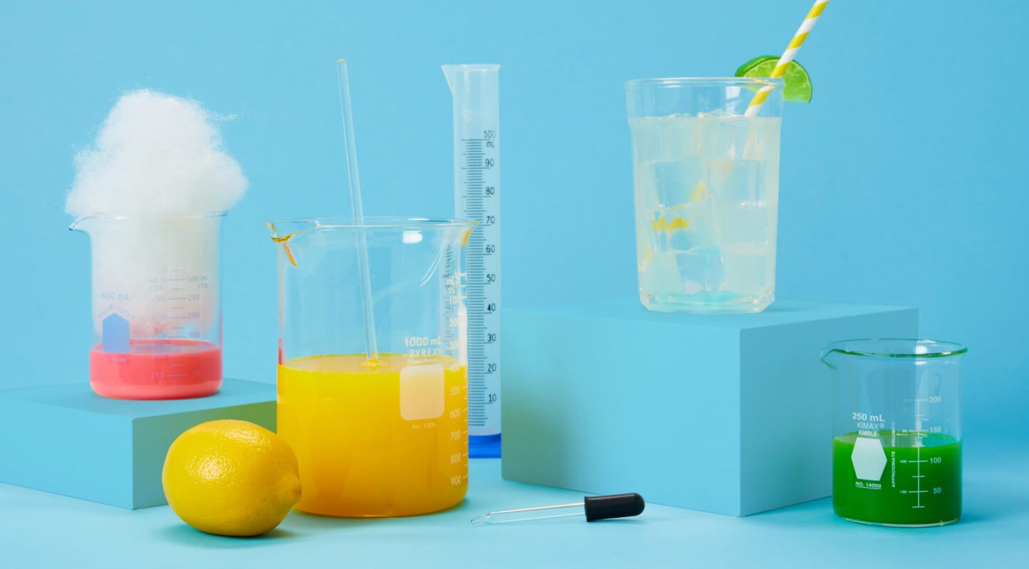
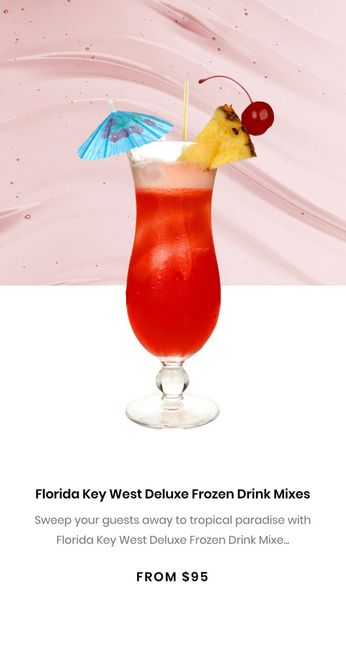
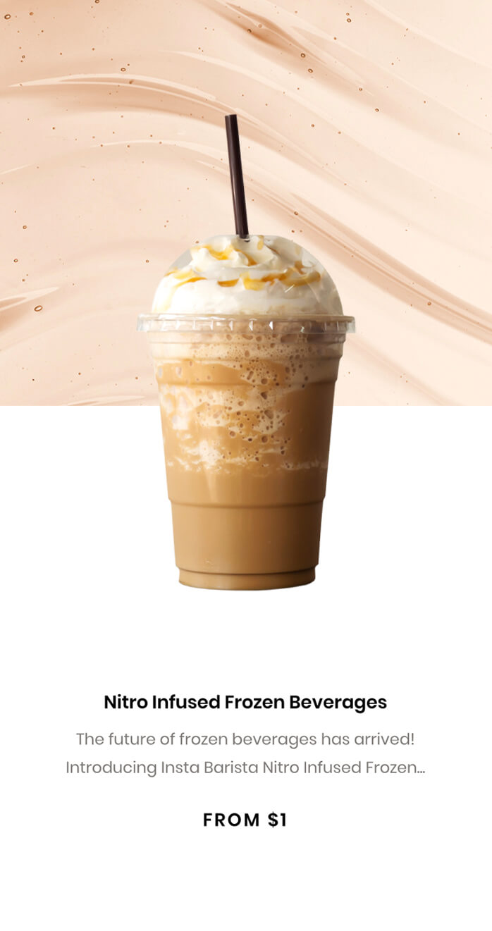
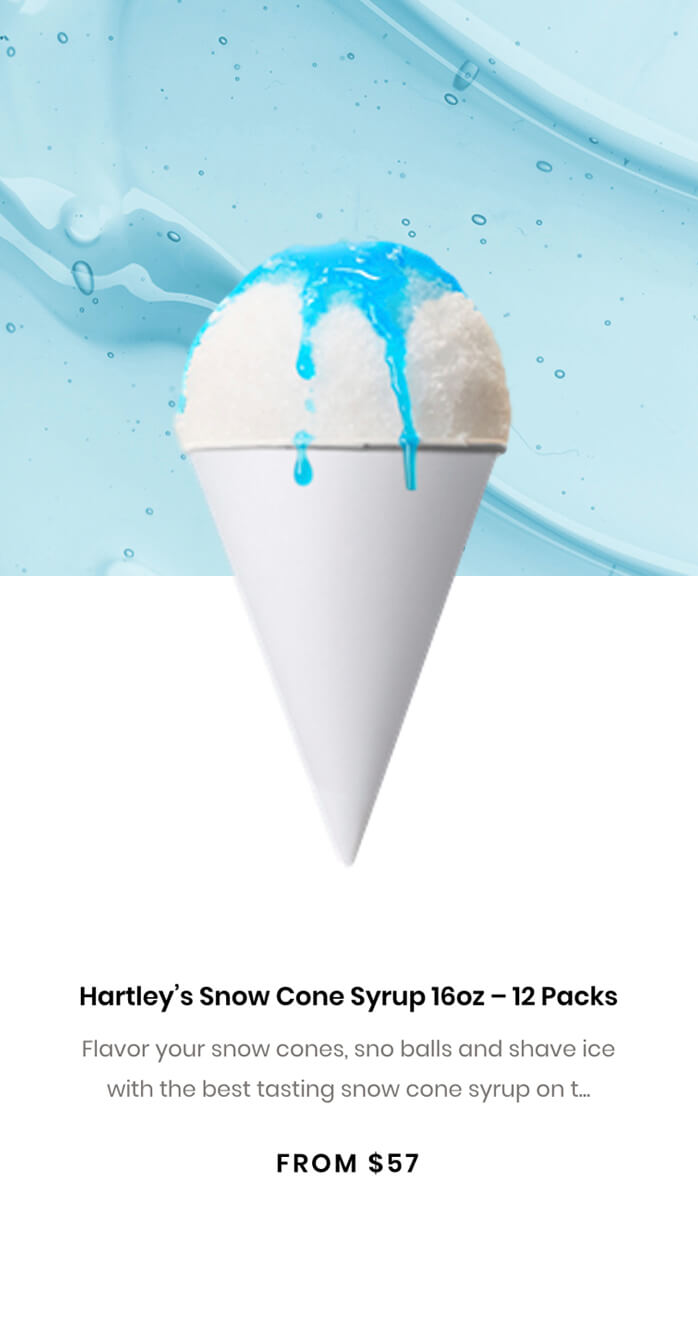
H&H’s photography style is bright, imaginative, fun, and a little over the top. It focuses on the ingredients themselves in the simplest form, as well the potential to build beautiful yet complex creations when mixed together.